
01 DIGS MAGAZINE
‘Digs’ is a magazine I created which is dedicated to exploring the unique and unconventional homes and living spaces that inspire and challenge us to think differently about the spaces we inhabit. It devles into the stories of those who have chosen to live in unique spaces, and the impact it has had on their lives as well as exploring the ways in AI is transforming the way we design and inhabit our living spaces.
Read more
editorial
art direction
typography
art direction
typography


02 DEAR MEN
Newspaper broadsheet created alongside a chair as part of a collaborative project which aims to raise awareness around unfair treatment and sexual harassment within the workplace. The imagery for this project has also been used in the BA Graphic Design’s course promotional campaign for the annual degree show. Multiple billboards of our work were placed around Bristol.
Read more
editorial
creative direction
typography
photography
copywriting
creative direction
typography
photography
copywriting

03 WOVEN WONDERS
Wicker furniture has been a staple of home decor for centuries, but its origins and cultural significance are often overlooked. This book delves into the fascinating history of wicker furniture, from its early use in ancient Egypt and Rome to its widespread popularity in Victorian England and beyond.
Read more
editorial
bookbinding
typography
publishing
copywriting


04 CONFIDENCE IS A CULT
A zine created to explore the toxicity of confidence culture. The main focus was to highlight how the trend ignores inequalities in social structures that prevents women and marginalised groups of people to reach their full potential.
Read more
A zine created to explore the toxicity of confidence culture. The main focus was to highlight how the trend ignores inequalities in social structures that prevents women and marginalised groups of people to reach their full potential.
Read more
editorial
bookbinding
typography
bookbinding
typography

05 DISOBEY THE GRID
A poster that challenges conventional design was created for an event called ‘An Index.’ The poster had to be made in conjuction with someone who was not a designer. Relinquishing my dominance as a designer and collaborating with someone who isn’t a designer was key to this project.
Read more
A poster that challenges conventional design was created for an event called ‘An Index.’ The poster had to be made in conjuction with someone who was not a designer. Relinquishing my dominance as a designer and collaborating with someone who isn’t a designer was key to this project.
Read more
poster campaign
collage
typography

06 THE EAMES LEGACY
Charles and Ray Eames were not only pioneers in furniture design, but they were also known for their interdisciplinary approach to design. They were architects, filmmakers, and graphic designers, and their work in these fields influenced their furniture designs. This publication explore how their diverse interests and skills informed their design philosophy and how they brought a fresh perspective to furniture design.
Read more
editorial
bookbinding
typography
editorial
bookbinding
typography
bookbinding
typography

07 ISTD
In response to an ISTD brief, 1984, a novel written by George Orwell, has been re-designed using a modern lens. This adaptation of the book focuses on the theme of censorship that is prominent with Orwell’s dystopian world.
Read more
In response to an ISTD brief, 1984, a novel written by George Orwell, has been re-designed using a modern lens. This adaptation of the book focuses on the theme of censorship that is prominent with Orwell’s dystopian world.
Read more
editorial
bookbinding
typography
editorial
bookbinding
typography
bookbinding
typography
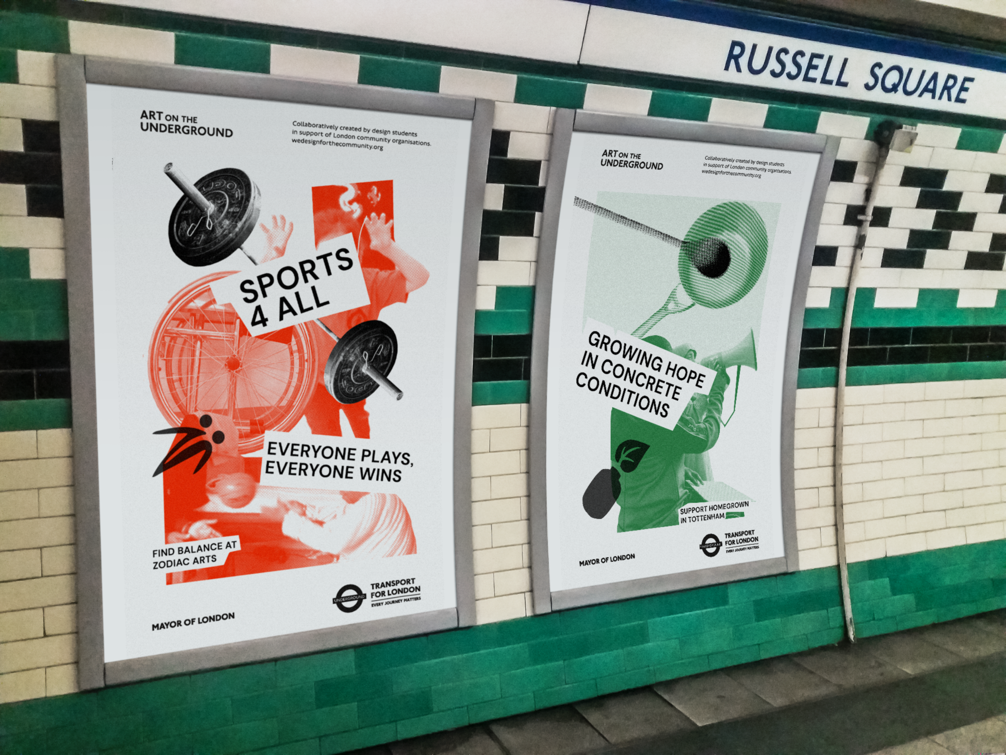
08 ART ON THE UNDERGROUND
I was involved in a design programme called ‘We Design For The Community’ which works in partnership with the Mayor of London’s Office. I was given the opportunity to work on a collaborative brief to design posters to be disaplyed on the London Underground Stations. This was done in collaboration with GLA and Art on the Underground.
Read more
poster campaign
collage
typography
copywriting
collage
typography
copywriting